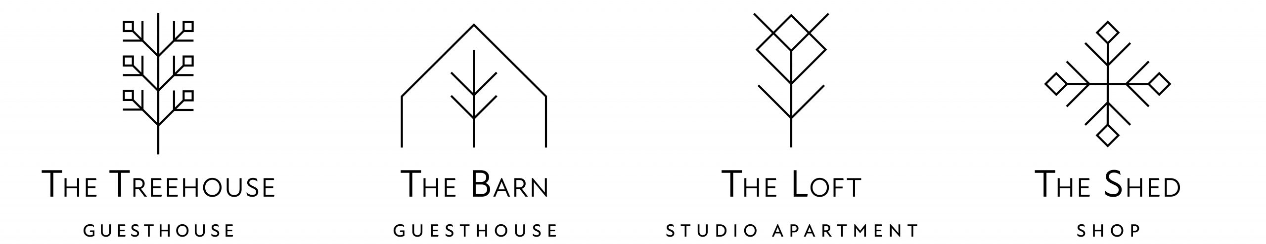
Client: Habitat Riverside Lodging
Branding
Taos, New Mexico, USA
These logos are inspired by the essence of nature, capturing a feeling of cleanliness, simplicity, peace and rejuvenation that one experiences when staying at Habitat.
Client: Taos Center For The Arts
Rebranding
Taos, New Mexico, USA
This logo represents the location of the Taos Center for the Arts in Taos New Mexico, rooted alongside Taos mountain. The solidity of form suggests the Center’s central place in the Taos community. The brief was to create a more contemporary look using the mountain as a core element. The brand is integrated onto corporate stationery, website, signage, all event marketing materials, e-blasts, tote bags, mugs etc.
Client: Friday Motors
Rebranding
Taos, New Mexico, USA
This logo captures the streamlined feeling of purchasing a car from Friday Motors. It is also and honoring of the family-owned business and original logo designed by the owner himself, seen in the letter “f”. The brief was to create a fresh, current look while still honoring the past.The brand is integrated onto corporate stationery, decals, keyrings and number plates.
Client: Couse-Sharp Historic Site
Rebranding
Taos, New Mexico, USA
This logo represents the two artists and one place – Eanger Irving Couse & Joseph Henry Sharp, founding members of the Taos Society of Artists, and the location of their studios that sit together on the actual site. These two painters helped create the cultural fabric of Taos and the West as we know it today. The brief was to create a logo that looked professional, scholarly, solid, about art, textured, contemporary and timeless.The brand is integrated onto corporate stationery, website, ads and newsletters. Part of the rebrand included a new website design.
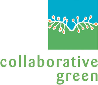

Client: Collaborative Green
Corporate Identity
Taos, New Mexico, USA
Collaborative Green consults in sustainable business development. The image was inspired by the San Bushmen culture and their artwork. The San are the oldest inhabitants of Southern Africa, where they have lived for at least 20 000 years.
The logo design represents a seeded path and the interrelationship and balance between earth and sky. The brand is integrated onto corporate stationery and included the website design.
Client: Collaborative Green
Corporate Identity
Taos, New Mexico, USA
This logo forms part of a new brand for a folk art gallery located in Taos, New Mexico. It represents “El Irrigador”, (The Irrigator), who is synonymous with the farming culture and tradition of this area.
Client: Heritage Trust
Logo
Taos, New Mexico, USA
This logo represents the balance and order one looks for when choosing a trust company.
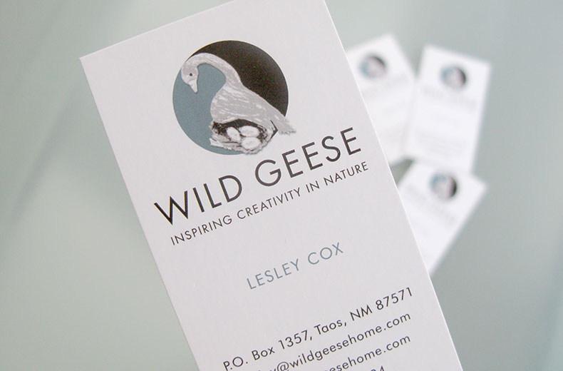
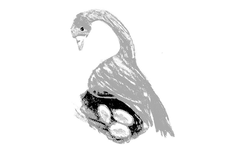
Client: Wild Geese
Corporate Identity
Taos, New Mexico, USA
This identity was designed to suggest the nuturing of, and being nutured by, the natural world, and the yin-yan balance and feeling of oneness that is achieved when interacting in nature.
The goose, an integral element in the corporate identity, was inspired by a drawing my daughter, Ryan, did when she was nine years old.
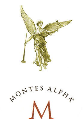
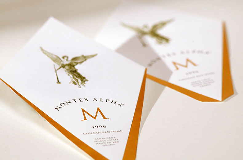
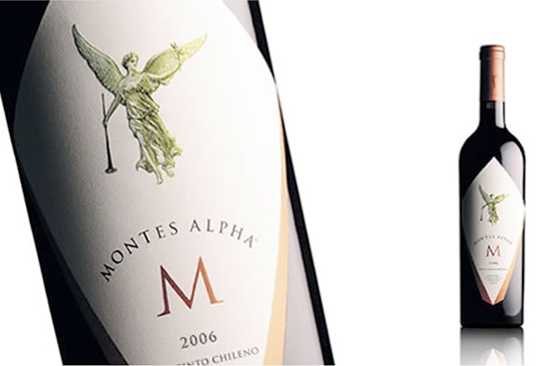
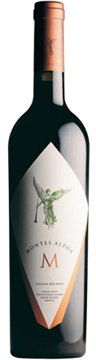
Client: Discover Wines
Montes Alpha M Label Branding
Santiago, Chile
The stark simplicity of the letter M creates a statement for one of this wineries most prestigious wines. The use of copper foil adds elegance and the embossed angel illustration adds dimension and beauty. The shape of the label was specifically designed to create an outward thrust of energy similar in feeling to the angel’s wings. The bottle also has a slight outward flare towards the top.
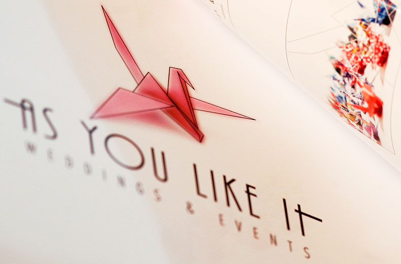
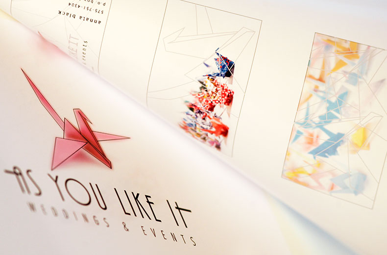
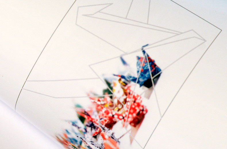
Client: Annatta Black
As You Like It – Weddings & Events Branding
Taos, New Mexico
This concept reflects the attention to detail and precision that is put into the planning of special events. The idea of a Japanese couple folding 1000 cranes before their wedding day suggests the commitment delivered by this company when planning such events.
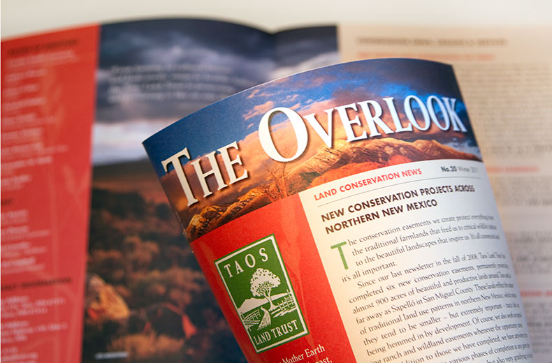
Client: Taos Land Trust
Rebranding
Taos, New Mexico, USA
This concept reflects the purpose of the Taos Land Trust who focuses on being vigilant stewards of the land and water in this area, who support ranchers who have chosen to restore their grasslands, and who work to preserve the landscapes and livelihoods of our community.

Client: Sharon Leach
Logo
Taos, New Mexico, USA
This logo was designed for a media company focusing on environmental sustainablilty. The form was inspired by the shape of a pine seedling, opening up while still protecting the inner seed.
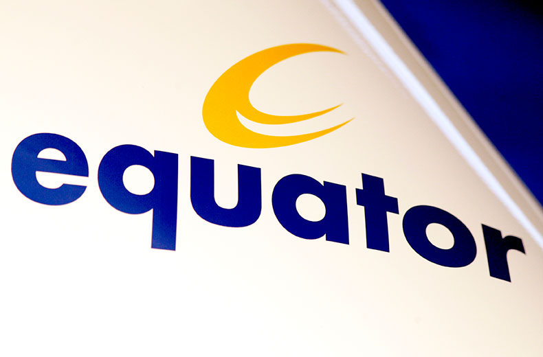
Client: Equator Group
Corporate Identity
Taos, New Mexico, USA
This logo represents an abstracted “E” in a distorted circle suggesting the equator. It was designed for a group of management consultants who were working in this region of the world.